A Photographer’s Guide to Precision Editing
In the realm of photography, capturing the perfect moment is an art, and every stroke of color contributes to the masterpiece. One often overlooked but crucial aspect is color balance. It’s the magic wand that can transform a dull image into a vibrant visual feast. In this blog post, we delve into the world of color balance adjustments, exploring why they are essential, the general settings photographers swear by, and the common challenges faced in pursuit of the perfect hues.
Why Color Balance Matters: Beyond Aesthetics
Color balance goes beyond mere aesthetics; it’s the essence of visual storytelling. Accurate color representation ensures that the emotions and atmosphere of the scene are faithfully conveyed. Imagine a serene sunset appearing overly warm or a snowy landscape tainted with unnatural blues. In both cases, the color balance is off, disrupting the intended narrative.
Photographers, both amateurs and professionals alike, seek to convey a certain mood through their images. The subtle interplay of warm and cool tones, for instance, can evoke feelings of coziness or isolation. To achieve this, mastering color balance adjustments is imperative.
General Settings Photographers Use for Color Balance: Unveiling the Palette
- White Balance Settings: The Foundation of Color Harmony
White balance is the cornerstone of color balance adjustments. It ensures that whites appear truly white, anchoring the rest of the color spectrum. Most photo editing software provides preset white balance options such as daylight, cloudy, tungsten, and fluorescent. Photographers select the appropriate setting based on the lighting conditions when the image was captured.
For more precision, many photographers opt for custom white balance settings. This involves using a neutral gray card or an area in the image that should be a true neutral color. The software then adjusts the entire color balance based on this reference point.
- Temperature and Tint Controls: Fine-Tuning the Spectrum
Beyond white balance presets, the temperature and tint controls allow photographers to fine-tune the color balance. Temperature adjusts the warmth or coolness of the overall image, while tint controls the green-to-magenta spectrum. These sliders are powerful tools for achieving nuanced color effects. For instance, increasing the temperature can infuse an image with a golden glow, while adjusting the tint can correct unwanted green or magenta casts.
- Color Grading: Elevating the Visual Experience
Color grading takes color balance to the next level. It involves selectively adjusting the colors in different parts of the image to create a desired mood or atmosphere. This is where photographers can let their creativity shine. Some common color grading techniques include split toning, where different tones are applied to highlights and shadows, and selective color adjustments to emphasize or de-emphasize specific hues.
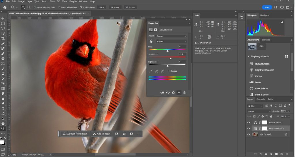
- Saturation and Vibrance: Adding Life to Colors
Saturation and vibrance controls allow photographers to intensify or desaturate colors selectively. Saturation affects all colors equally, while vibrance is more intelligent, preserving skin tones and preventing over-saturation of already vibrant colors. These controls are essential for achieving that perfect balance where colors pop without appearing unnatural.
How to Adjust Color Balance: A Step-by-Step Guide
Now that we understand the importance of color balance and the tools at our disposal, let’s walk through a step-by-step guide on how to adjust color balance using popular photo editing software.
- Import Your Image: Start by importing your image into the editing software of your choice. Ensure that you are working with a high-resolution file to retain image quality.
- Set White Balance: Begin by setting the white balance. If the lighting conditions are known, choose the appropriate preset. For more accuracy, use a custom white balance by selecting a neutral reference point.
- Temperature and Tint Adjustment: Fine-tune the color balance by adjusting the temperature and tint sliders. Experiment with different values to achieve the desired warmth or coolness and correct any unwanted color casts.
- Color Grading: Enter the realm of color grading. Experiment with split toning, selective color adjustments, and other creative techniques to enhance the mood of your image.
- Saturation and Vibrance: Fine-tune the intensity of colors using saturation and vibrance controls. Be mindful not to over-saturate, as it can lead to unrealistic and unpleasing results.
- Compare Before and After: Most editing software allows you to compare the edited version with the original. This is a crucial step to ensure that your color balance adjustments enhance rather than detract from the image.
- Save Your Work: Once satisfied with the color balance adjustments, save your edited image. Consider keeping a copy of the original file to preserve the flexibility for future edits.
Challenges in Adjusting Colors: Navigating the Pitfalls
While the journey to perfect color balance is rewarding, it’s not without its challenges. Photographers often encounter hurdles that require finesse and experience to overcome.
- Inconsistent Lighting Conditions: Shooting in changing or mixed lighting conditions can make achieving consistent color balance challenging. This is where the skill of choosing the right white balance setting or resorting to custom white balance becomes crucial.
- Color Calibration Discrepancies: Variations in display calibration between different devices can lead to discrepancies in how colors are perceived. What looks perfect on your monitor might appear differently on another. Regularly calibrating your monitor and using color-managed workflows can mitigate this issue.
- Preserving Skin Tones: When making global color adjustments, preserving natural skin tones is a delicate task. The vibrance control, which intelligently adjusts saturation while protecting skin tones, is a valuable tool in such scenarios.
- Over-Editing: It’s easy to get carried away with color adjustments, leading to over-saturation or unnatural tones. Regularly zooming out and viewing the image as a whole can help prevent this pitfall.
- File Compression Artifacts: When saving edited images, especially in formats with lossy compression, there’s a risk of introducing artifacts that affect color quality. Choosing the right file format and compression settings is crucial to minimize these issues.
The Art and Science of Perfecting Color Balance
In the intricate dance of pixels and hues, mastering color balance is both an art and a science. It’s about understanding the technical aspects of white balance, temperature, and tint, while also embracing the creative possibilities of color grading. As photographers, the pursuit of perfect color balance is a continual journey, filled with challenges and triumphs.
So, the next time you embark on a photo editing adventure, remember that each adjustment contributes to the symphony of colors that tell the story captured through your lens. With the right knowledge and a touch of creativity, you can elevate your images to new heights, where every color is a brushstroke in the masterpiece of visual storytelling.